PRODUKTBESCHREIBUNG
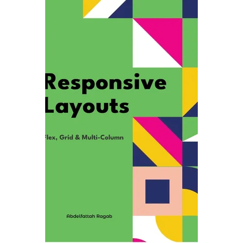
by Abdelfattah Ragab (Author)
Welcome to the book "Responsive Layouts: Flex, Grid and Multi-Column" In this book I explain the three best-known responsive layouts: the Flexbox, the Grid and the Multi-Column layout. Flexbox is a one-dimensional layout that only works in one dimension at a time, either horizontally or vertically. The grid layout is a two-dimensional layout that distributes the elements horizontally and vertically at the same time. The multi-column layout is a special layout for magazines and newspapers, where the text should flow in columns with spacing, rules, etc. I'll explain all the properties and their values and how they affect the distribution of elements on the screen. So let's get started.
Number of Pages: 202
Dimensions: 0.63 x 9 x 6 IN
Publication Date: November 11, 2024